Waldorfschule Engelberg
One of Germany’s most storied Waldorf schools, one coherent brand: for the Free Waldorf School Engelberg we redeveloped the visual identity, from creative workshop to new logo to a complete corporate design.
Developing the brand together
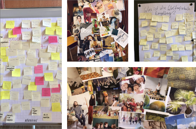
A school is no ordinary brand, it belongs to its community. So we started not with a draft but with a creative workshop: together with representatives of the school community we gathered values, strengths and visions of the Engelberg, then sorted, condensed and sharpened the positioning.
Pinboards full of sticky notes became the foundation of the new brand: clear, warm-hearted and confident, with head, heart and hand.
A wing for the Engelberg
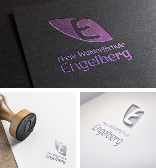
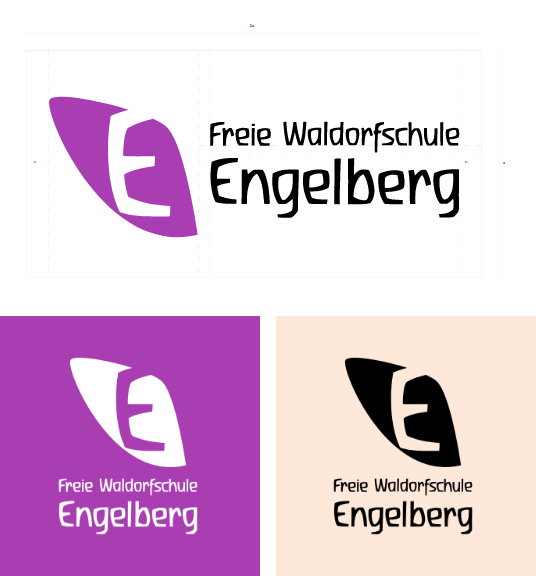
The new mark tells two stories at once: it forms an angel’s wing, the natural translation of the name Engelberg. And it carries a cut-out “E”, the recognisable heart of the old logo that accompanied generations of pupils.
The brand thus unites heritage and new beginnings in a single shape, complemented by a strong violet and clear, friendly typography.
From letterhead to poster
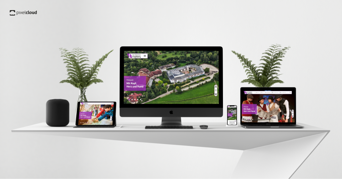
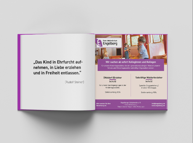
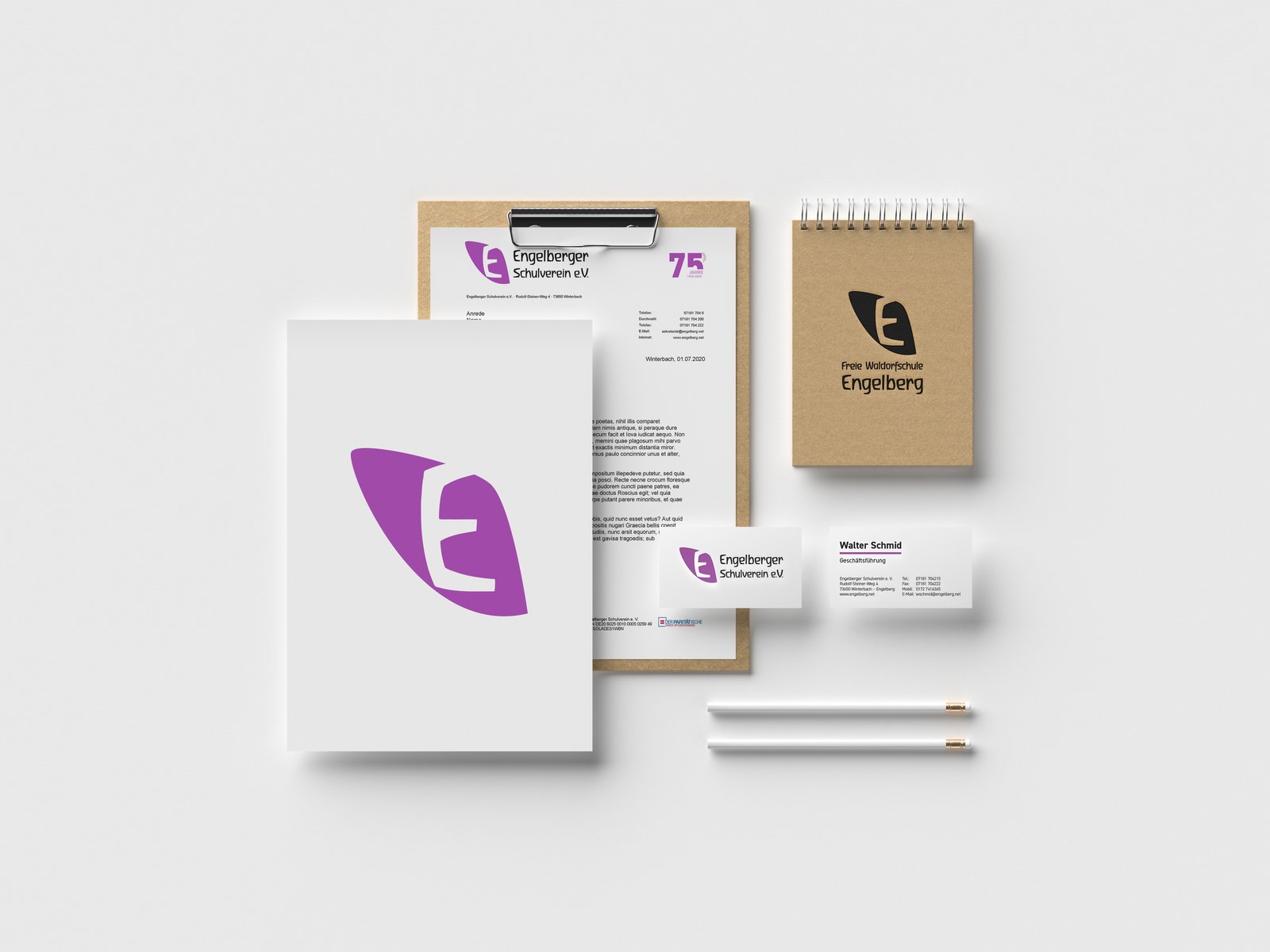
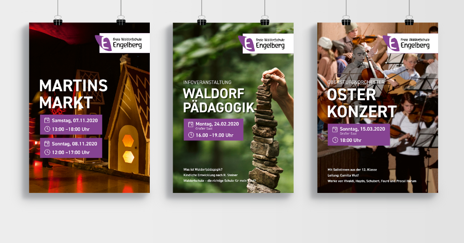
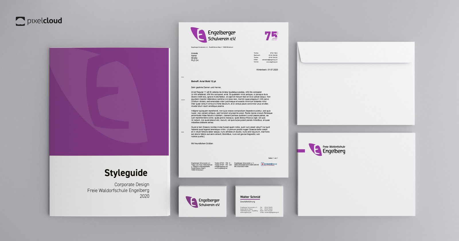
Based on the new logo we created a complete corporate design: stationery, brochures, event posters for the Martinsmarkt and concerts, forms, and design templates for the website. A flexible system that brings the many voices of the school community under one roof and is easy to use for everyone from administration to parent groups.

A brand that stayed
The finest compliment for a corporate design is its longevity: the wing with the “E” still welcomes every visitor on engelberg.net and shapes the school’s identity, from nursery to upper school.